css轻松写出梦幻西游动画效果
1. 首先准备需要用到的素材

素材下载地址:https://resoure-1252202390.cos.ap-nanjing.myqcloud.com/xiyou.rar
2. 书写HTML结构
    <body>
        <div class="houzi"></div>
        <div class="bajie"></div>
        <div class="tanshen"></div>
        <div class="shashen"></div>
    </body>
3.添加背景图片
        <style type="text/css">
            body {
                background: url(images/background.webp) no-repeat;
            }
        </style>
4.把图片添加到背景上
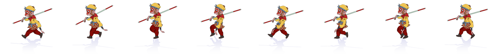
从下面的一张图片可以看出,这时一张动作连续的雪碧图,大小为1600px180px,里面有八个人物,所以第一个人物的大小就是200px180px ,素材里面有几张不一样大小的图片,我们根据宽度除以里面的人物数量就可以得出每一张的大小。最后使用定位,移动到页面上的某个位置。
            .houzi {
                position: absolute;
                width: 200px;
                height: 180px;
                top: 347px;
                left: 391px;
                background: url(images/猴哥.png) no-repeat;
            }


            .bajie {
                position: absolute;
                width: 200px;
                height: 180px;
                top: 347px;
                left: 600px;
                background: url(images/八戒.png) no-repeat;
            }

            .tanshen {
                position: absolute;
                width: 170px;
                height: 240px;
                top: 315px;
                left: 770px;
                background: url(images/唐僧.png) no-repeat;
            }

            .shashen {
                position: absolute;
                width: 210px;
                height: 180px;
                top: 347px;
                left: 938px;
                background: url(images/沙僧.png);
            }
5.定义动画
background-position: 0 0; 第一个参数为x轴,第二个参数为y轴,很明显我们只需要用到x轴,从0开始,结束为我们图片的大小,这里我们是向左走,所以为负数。
            /* 定义动画 */
            @keyframes move {
                from {
                    background-position: 0 0;
                }

                to {
                    background-position: -1600px 0;
                }
            }
6.使用动画
定义一个类名,animation: move 1.4s steps(8) infinite; 第一个参数为我们定义的动画名字,第二个参数表示动画执行的时间,第三个参数这个用了steps这个函数,它表示分多少步走完这个动画,前面我们设置了大小为200px的盒子,图片为1600px,很明显走完一张图片需要8步。最后一个参数表示无限执行当前动画。
        .attribute {
                /* 动画持续时间1.4s 分八步走完 无限循环 */
                animation: move 1.4s steps(8) infinite;
            }
7.让图片动起来
很简单给我们的div盒子添加上面定义好的类名。这里之所以只给俩个添加是因为这俩张图片的大小是一模一样的,其他俩张的大小是不同的。所以我们需要重新定义动画。
    <body>
        <div class="houzi attribute"></div>
        <div class="bajie attribute"></div>
        <div class="tanshen"></div>
        <div class="shashen"></div>
    </body>
8.给另外俩张图片添加动画(大小不同,所以要单独定义)
        @keyframes shashen {
                from {
                    background-position: 0 0;
                }

                to {
                    background-position: -1680px 0;
                }
            }

            @keyframes tanshen {
                from {
                    background-position: 0 0;
                }

                to {
                    background-position: -1360px 0;
                }
            }
9.让最后俩个人物动起来
.tanshen {
                position: absolute;
                width: 170px;
                height: 240px;
                top: 315px;
                left: 770px;
                background: url(images/唐僧.png) no-repeat;
                /* 动画持续时间1.4s 分八步走完 无限循环 */
                animation: tanshen 1.4s steps(8) infinite;
            }

            .shashen {
                position: absolute;
                width: 210px;
                height: 180px;
                top: 347px;
                left: 938px;
                background: url(images/沙僧.png);
                /* 动画持续时间1.4s 分八步走完 无限循环 */
                animation: shashen 1.4s steps(8) infinite;
            }
10.最后全部代码如下:
<!DOCTYPE html>
<html>
<head>
<meta charset="utf-8">
<title>梦幻西游</title>
<style type="text/css">
body {
background: url(images/background.webp) no-repeat;
}
/* 定义动画 */
@keyframes move {
from {
background-position: 0 0;
}
to {
background-position: -1600px 0;
}
}
@keyframes shashen {
from {
background-position: 0 0;
}
to {
background-position: -1680px 0;
}
}
@keyframes tanshen {
from {
background-position: 0 0;
}
to {
background-position: -1360px 0;
}
}
.attribute {
/* 动画持续时间1.4s 分八步走完 无限循环 */
animation: move 1.4s steps(8) infinite;
}
.houzi {
position: absolute;
width: 200px;
height: 180px;
top: 347px;
left: 391px;
background: url(images/猴哥.png) no-repeat;
}
.bajie {
position: absolute;
width: 200px;
height: 180px;
top: 347px;
left: 600px;
background: url(images/八戒.png) no-repeat;
}
.tanshen {
position: absolute;
width: 170px;
height: 240px;
top: 315px;
left: 770px;
background: url(images/唐僧.png) no-repeat;
animation: tanshen 1.4s steps(8) infinite;
}
.shashen {
position: absolute;
width: 210px;
height: 180px;
top: 347px;
left: 938px;
background: url(images/沙僧.png);
animation: shashen 1.4s steps(8) infinite;
}
</style>
</head>
<body>
<div class="houzi attribute"></div>
<div class="bajie attribute"></div>
<div class="tanshen"></div>
<div class="shashen"></div>
</body>
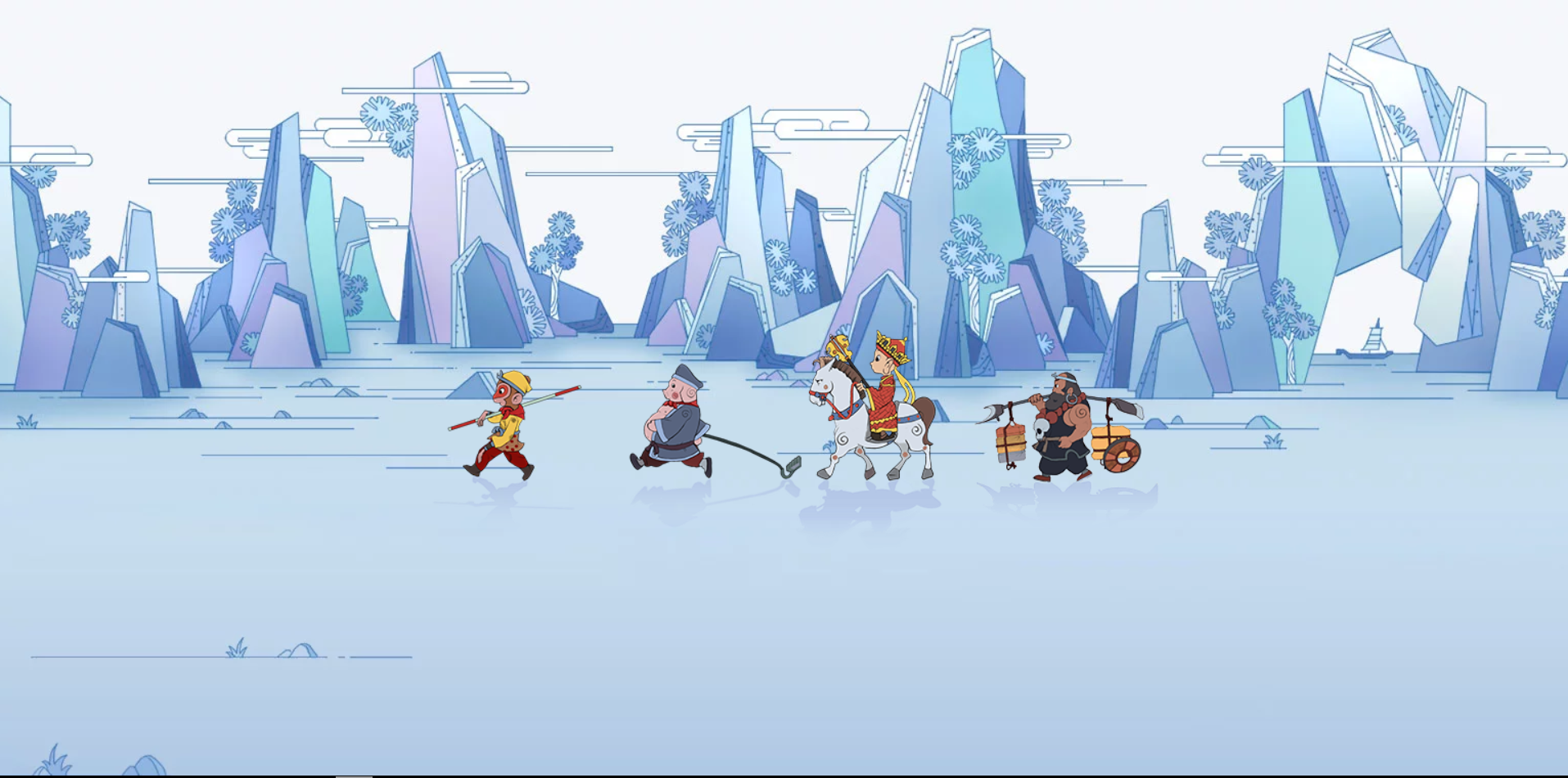
</html>11.效果如图: